
Web developer tools are crucial for improving the overall user experience for your customers. Google’s popular web browser, Chrome, has developer tools built inside the browser. It’s a set of tools made for web-authoring and debugging. The Chrome Developer Tools (known as DevTools) give developers the insight into the how the website is pieced together.
Using Chrome DevTools you can know the styles that are used, the size of the images, the scripts that are used, etc. You can debug and know what errors exist on the page. You can even toggle styles on or off, or change them completely, to see what effect it has on your website, this can be handy to see how the website looks without certain scripts running.
It’s all up inside your Browser
The tools themselves are easy to get to. Here are three ways to open them:
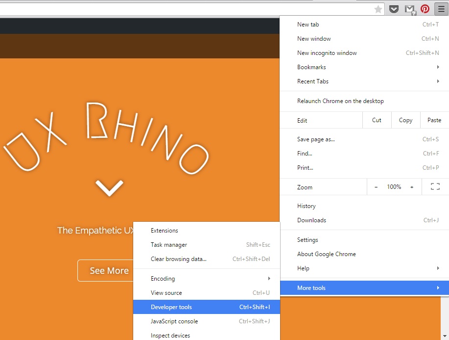
- In your Chrome browser – select the Chrome menu (the three horizontal bars in the top right corner), select More Tools, and then select Developer Tools.
- Right click on an element on any web page and select Inspect Element.
- On your keyboard in Windows select Ctrl + Shift + i. On Mac select Cmnd + Opt + i.
Any of these will open up the useful DevTools window onto your desktop.
The tools appear at the bottom of your screen. You’ll see a primary window with menus across the top and elements as the default view, and a secondary window with menus, and styles as the default selection.
The tools are grouped into tasks. There are 8 groups that includes Elements, Network, Sources, Timeline, Profiles, Resources, Audits, and Console.
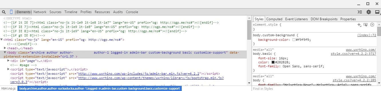
Here you can see your page’s HTML structure. There is a toggle at the bottom for HTML and Body. You can mouse over any of the elements to see detailed information about each one.
You can click on the arrows to open and close the contents of the primary elements to make them easier to read. So you can close the body and just read the header, choose element within the header to see, etc. This is an excellent tool for viewing your website’s HTML.
Network
This shows each element that will be loaded, how they are loaded, the type of file it is, the size of the file, the time it takes to load, and a timeline of when it will be loaded within the page-load sequence. This can be used to troubleshoot network issues such as bottlenecks in page-loading and bad requests. For example, if you see a lot of 404 errors you can look closer to see what the issues are. Maybe you’ve taken a page down that is still getting a lot of traffic, or maybe someone has typed a link wrong.
Sources
This shows the scripts and snippets that will load and where they’re coming from.
Timeline
This shows you the time for each resource to load. You can see what takes the most time, which helps in reduce your page-loading.
Profiles
This shows the memory usage of each element. This is great for showing you which code needs to be optimized.
Resources
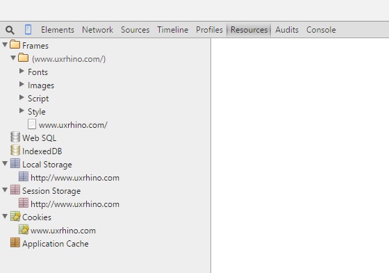
Here you can inspect the resources that are loaded. You can look at cookies, application cache, HTML5 databases, etc.
Audits
This lets you analyze the page. You can audit after it has loaded or as it loads.
Audit Present State
First, I selected to run Audit Present State. This runs the audit as the site currently sits, already loaded into my browser.
It gives me a list of items, colors them according to their importance, and shows the number of issues. I can see more detail by clicking on them.
I’ve expanded several of them to see the detailed information about each one. It gives me information on Network Utilization and Web Page Performance. It gives me advice on how to fix the issues and prioritizes them for me.
Reload Page and Audit on Load
I went back and selected to audit on load. The results are similar, but as expected there are more issues on loading the page than after the page has loaded.
Between the two I get information about JavaScript, browser caching, proxy caching, cookie size, serving content from a cookieless domain, image dimensions, order and styles of scripts, placing CSS in the document head, removing unused CSS riles, and using normal CSS property names. Of course the results will vary depending on the site.
The information isn’t as detailed as PageSpeed Insights, but it’s enough to get me started and I like the convenience of it being built in to the tool I’m using anyway. I recommend running it every time you make a change to your site. It’s too easy to use to not use it.
Console
This is the JavaScript Console where you can test pages and apps. You can debug your scripts and get advice on what changes to make. The Console allows you to enter commands so that you can interact with your webpage. It will log the diagnostics info to help you with debugging. You can use it in the main screen or in the drawer (the window under the main screen).
You can use the Console or Command Line API’s. You can write to the Console, format your elements and style outputs, measure the time of execution or loading, view and mark the timeline, count statements, set breakpoints, evaluate expressions, monitor events, stack messages, see errors and warnings, and much more.
This is a powerful tool, but there is a lot to using it. Fortunately good reference material is supplied with examples on how to use it.
Debugging
Selecting Ctrl + p in Windows, or Cmd + p on Mac, will open the debug screen where you can select the scripts to debug. This tool gives you the debugging features you’d expect to see in any programming environment: pause, continue, step into, step over, breakpoints, formatted code, etc.
Detailed help files are provided to step you through using the debugging mode.
CSS Styles Window
The box on the far right contains all of the CSS information. As you select an element, the Styles window to the right shows you the styles info for the element. This section is interesting. There are five groups of tools: Styles, Computed, Event Listeners, DOM Breakpoints, and Properties.
Styles
You can select the styles and manually change them in this window. For example, you can select the font size and color.
Select the font size and enter your own size. When you do, the font size of the font you selected will change on the screen.
Making the selection on a font color will open up the color-picker. Select the color you want and hit enter. You’ll see the font that you selected change to the new color. This is a great way to try out new font styles, sizes, and colors.
If you click on site.CSS on the right you’ll open a larger window with the information in detail. Here, you can type in the name of the font you want to use, specify a color, specify a size, etc.
Computed
This shows the box-sizing in pixels. It has padding, border, and margin.
Device Mode
There is a little button on the left between the magnifying glass and the Elements menu that look like a mobile device. Guess what? It is a mobile device. This is the device emulation mode. This is a great way to see how responsive your site is.
Device
What’s even cooler than it just being a mobile device is that you can choose which mobile device it is and then you can see the website as if you were looking at it on that device. Now, THAT’S awesome!
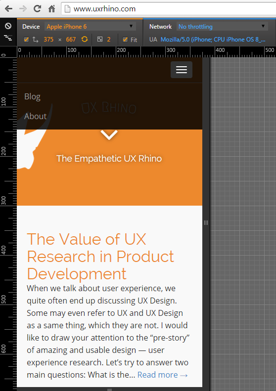
I selected iPhone 6 and the screen mimicked that device so I could see what the site would look like on its screen and how the touch would work, (represented with a circle.)
You can change the orientation of the screen by hitting the Swap Dimensions button.
This is a great way to see what your WordPress site looks like on the smaller mobile screen. I chose Galaxy Note 3 and the screen size changed to match the new screen size and resolution. There are many devices to view. You can also see a custom size by dragging the sides to increase or decrease the size, this is an amazing tool for testing on multiple mobile device platforms quickly and easily.
Network
There’s also a selection to choose the type of network you’re accessing the site through. This allows you to see your website’s performance through various connection types and speeds. You can test several speeds from 50 Kbps GPRS to 30 Mbps WiFi, and several 2G, 3G, and 4G connection speeds. This is an excellent way to test the speed of your website through carious networks and get insights on what to improve.
Media Queries
There is a little button in the top left that looks like stair steps. It opens another section of screen above the website window that shows different pixel widths. Clicking on them takes the mobile screen to that size. They show you:
- Queries targeting a maximum width
- Widths within a range
- Queries targeting a minimum width
This helps you to adjust the styles and media content for a fully responsive design.
The Drawer
There is another section of tools under the main screen called the drawer. This adds:
Console – this is the same console as in the primary window. By placing it here you can use it together with any of the tools in the primary window.
Search – allows you to search for sources.
Emulation – you can choose Device (Here you can choose the model, resolution, network, etc.), Media, Network (throughput and user agent), and Sensors (touchscreen, accelerometers, etc.).
Rendering – show paint rectangles, composited layer borders, FPS meter, continuous page repainting, and potential scroll bottlenecks.
Settings and More
The menu bar on the right will tell you the number of errors and warnings on your site, allow you to hide the drawer at the bottom, let you adjust the settings, and dock the tool to the main window (creating a split-screen between your website and the DevTools).
There is a vast amount of settings that you can adjust so you can modify the tools to work the way you need them to.
Chrome Canary
For those risk takers out there give Google Chrome Canary a whirl, its the latest and greatest from Google. Its not very stable so it will probably break your system!! But its worth a peak and getting a little look at what’s on offer here regarding the DevTools. – Quick the canary is bleeding – get it here – Google Chrome Canary –
Developer tool conclusion
Google Chrome’s Developer Tools is a great tool for troubleshooting, improving network performance, seeing your site on different screen sizes and resolutions, and getting information on where your site needs improvement. There are a lot of features and you can add even more through extensions. These tools alone are a great reason to install Google Chrome, even if it’s not your primary browser. Taking the time to learn the features will pay off and your site and visitors will thank you for it.
Your turn! Do you use Chrome Developer Tools? Did I leave out your favorite feature? Do you have anything to add? Please add your comments and experience with Chome Developer tools below.